Two-Tone Kitchen Cabinets: The Hottest Design Trend in Kansas City (With Examples)
Why Two-Tone Cabinets Are Dominating Kansas City Kitchens
Two-tone kitchen cabinets — using two different colors or finishes in the same kitchen — have gone from a niche design choice to the dominant trend in Kansas City kitchen design. At KC Cabinetry & Stone, two-tone orders now account for approximately 35% of all our kitchen projects, up from less than 10% just three years ago.
The appeal is simple: two-tone cabinets add visual depth, create focal points, and allow homeowners to express their personal style without committing to a single bold color throughout the entire kitchen. Done well, a two-tone kitchen feels custom, curated, and intentional. Done poorly, it can feel busy and disjointed.
This guide will show you how to get it right.
The Most Popular Two-Tone Combinations in Kansas City
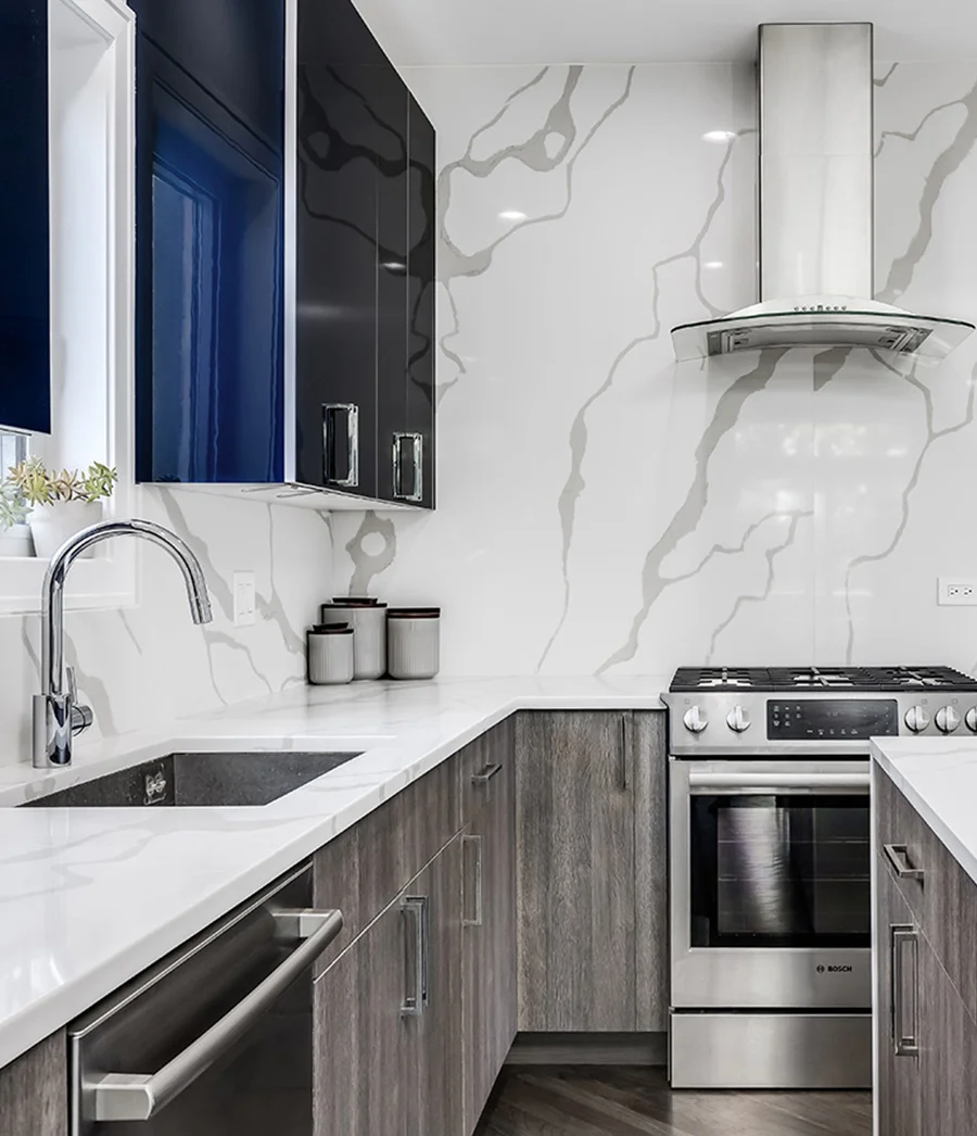
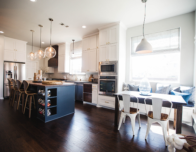
Reliable starting points include white perimeter cabinets with a navy island, white uppers with charcoal or dark-gray lowers, white perimeter cabinets with a natural-wood island, light gray with white, and white with a green focal area.
Additional configurations can work when they follow one deliberate placement rule: white uppers with navy lowers; white uppers with deep forest-green lowers; cream uppers with warm-gray lowers in lower-light or traditional rooms; or white painted cabinets with walnut or white-oak accents on an island, pantry bank, accent cabinet, or open shelving.
Rules for Getting Two-Tone Right
**Rule #1: Keep the upper cabinets lighter** Light colors on top and darker colors on the bottom follows the natural visual weight of a room. Reversing this (dark uppers, light lowers) can make the kitchen feel top-heavy and oppressive.
**Rule #2: Limit to two colors maximum** Two-tone means two tones, not three or four. Adding a third cabinet color almost always creates visual chaos. If you want more variety, introduce it through hardware finishes or countertop materials instead.
**Rule #3: Create a clear focal point** The most successful two-tone kitchens have one clear focal point — usually the island. If there is no island, use one logical zone such as a pantry bank, accent cabinet, lower-cabinet run, or open-shelf feature.
**Rule #4: Use the same door style in both colors** Mixing door styles and colors is risky. Using the same door style creates cohesion even with contrasting colors.
**Rule #5: Let the hardware unify the design** Using the same hardware finish on both cabinet colors creates a thread of consistency.
**Rule #6: Choose one dominant color** Aim for roughly a 70/30 or 60/40 visual balance instead of splitting the room into equal competing blocks.
**Rule #7: Test physical samples in the actual room** North- and south-facing daylight, warm and cool bulbs, flooring, and wall color can change how both finishes read. Review the samples together in the kitchen before ordering.
Countertop and Backsplash Pairing Tips
The countertop and backsplash choices are critical in a two-tone kitchen because they need to complement both cabinet colors.
**For high-contrast combinations (white + navy, white + charcoal):** Choose a countertop with movement and veining that incorporates both the light and dark tones. A white quartz with gray veining can bridge white uppers and dark lowers. Taj Mahal quartzite can complement white and navy, while a Calacatta-look quartz or quartzite can connect white and charcoal; the actual slab or sample still needs to be reviewed with both cabinet finishes.
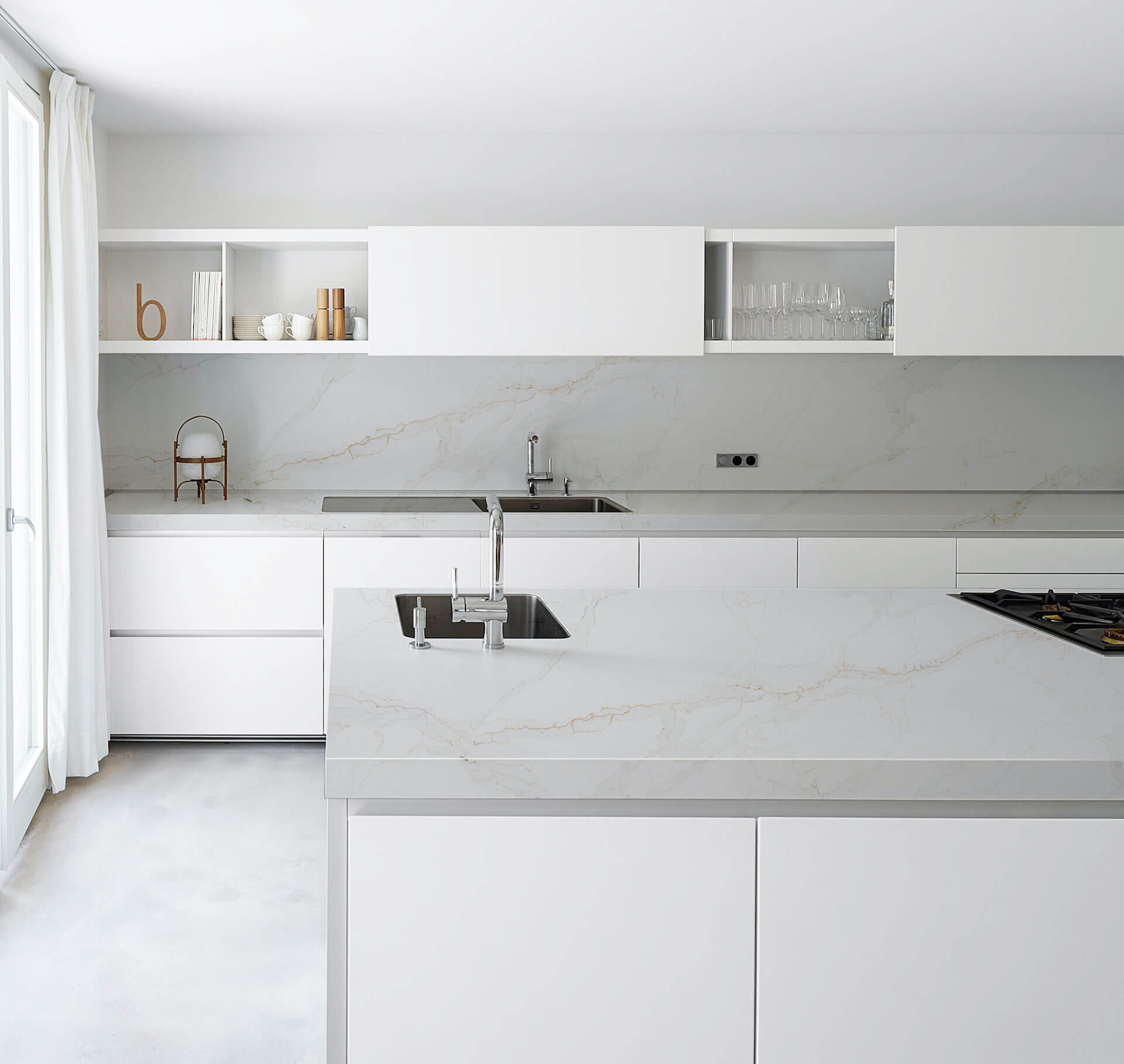
**For subtle combinations (white + light gray, cream + greige):** A solid or lightly veined countertop in white or light gray works well without competing with the cabinet colors.
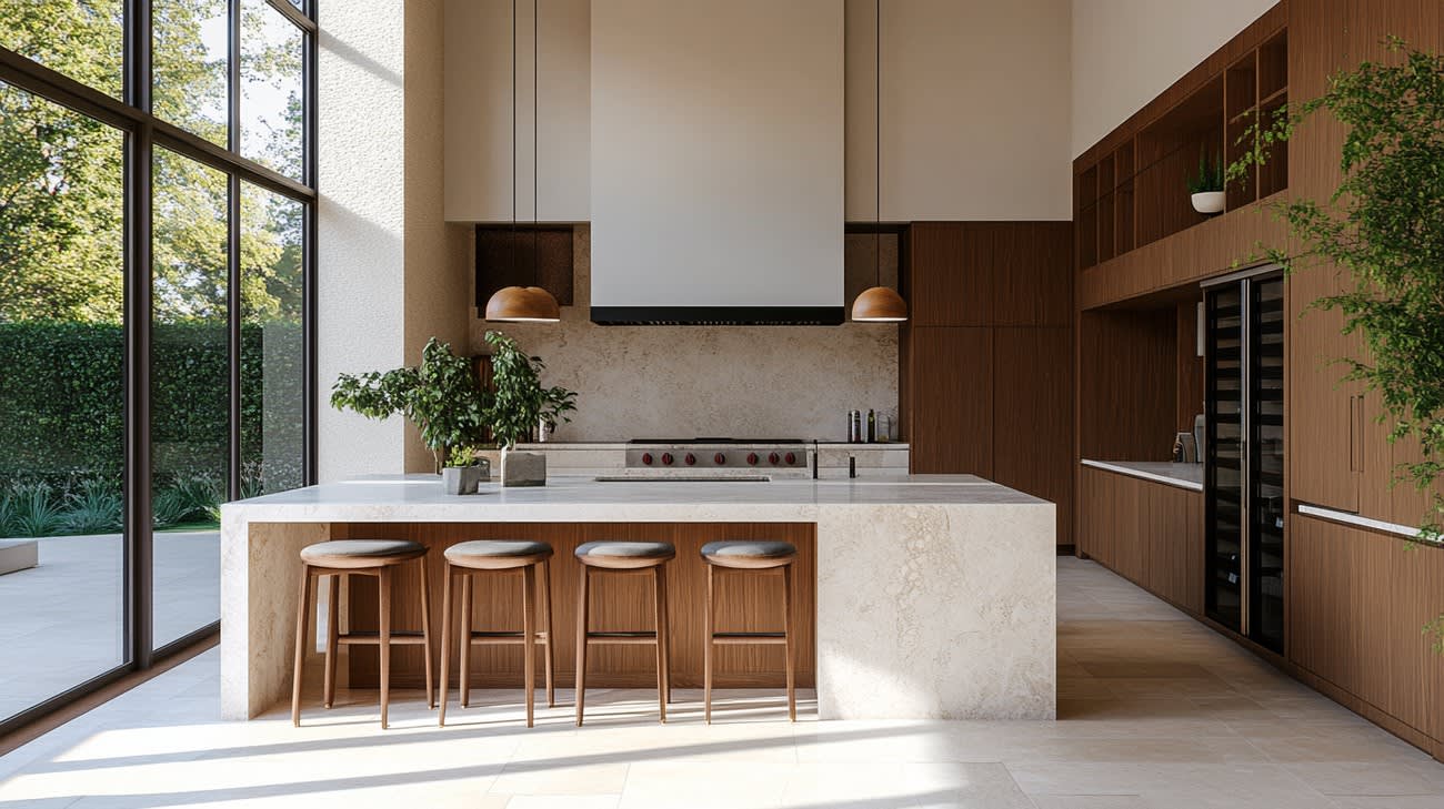
**For wood island combinations:** Let the wood be the star. Choose a simple, clean countertop that does not compete with the wood grain pattern.
**Backsplash guidance:** In two-tone kitchens, the backsplash should be neutral and simple. A busy backsplash pattern combined with two cabinet colors creates too much visual noise. White subway tile, simple herringbone, or a clean slab backsplash are dependable starting points.
Is Two-Tone Right for Your Kitchen?
**Two-tone works best when:** - Your kitchen has an island or another clear dividing point - Your kitchen is medium to large - You want a custom, designed look without using a bold color everywhere
A small kitchen can still use two tones when the contrast is soft, the upper cabinets stay light, and one color remains clearly dominant. Combinations such as white with warm gray or cream with soft blue are less likely to fragment the room.
**Consider single-tone instead when:** - You prefer a minimalist, streamlined aesthetic - You are renovating primarily for resale and want the broadest buyer appeal - The room has no natural focal zone and the two finishes would create visual breaks
Want to see two-tone options in your kitchen? Call **(816) 307-3720** for a free in-home design consultation. We will bring door samples in multiple colors so you can see how combinations look in your space, with your lighting, flooring, and walls.
Explore Our Services
Johnathan Kohrs
Founder & CEO, KC Cabinetry & Stone
With extensive experience in the Kansas City cabinet and countertop industry, Johnathan founded KC Cabinetry & Stone to provide homeowners with a one-stop shop for quality kitchen renovations at competitive prices.